OUT-OF-GAMUT COLORS (Or Colors That Don't Come Through Well in Photography)

WHY PAINTERS CAN USE COLORS THAT PHOTOGRAPHERS CAN ONLY DREAM OF!

By Guest Writer, Jared Updike (taken with permission from a Discord post in January 2026)

The colors that do not come through very well in photography are the secondary colors of light. So red, lime green, and blue, and everything on the triangle between them are well represented by triangle sRGB color space, but very saturated cyan, teal, turquoise, especially that greenish turquoise color, is one area that is out of gamut. Also, tangerine orange, yellow orange, and neon orange tend to clip. The last part is the line of purples, so super saturated magenta and fuchsia colors tend to clip and seem same-y whereas in the real world (outside of digital color reproduction) many more such colors and more subtlety is possible. So magenta, turquoises, certain oranges and also probably chartreuse colors too, in all their subtlety are clipped.

When you paint with those "out-of-gamut" colors your painting automatically does something that cannot be represented accurately by sRGB digital anything. (Although digital reproductions by definition will not do it justice. Womp womp!) So you get an automatic reason for using oil paints instead of just making digital prints of photos. I think it makes people do a double take because they have seen thousands of digital images that never show those colors. They may not be able to tell you why, but you will know why it catches people's eye.

See the image here.

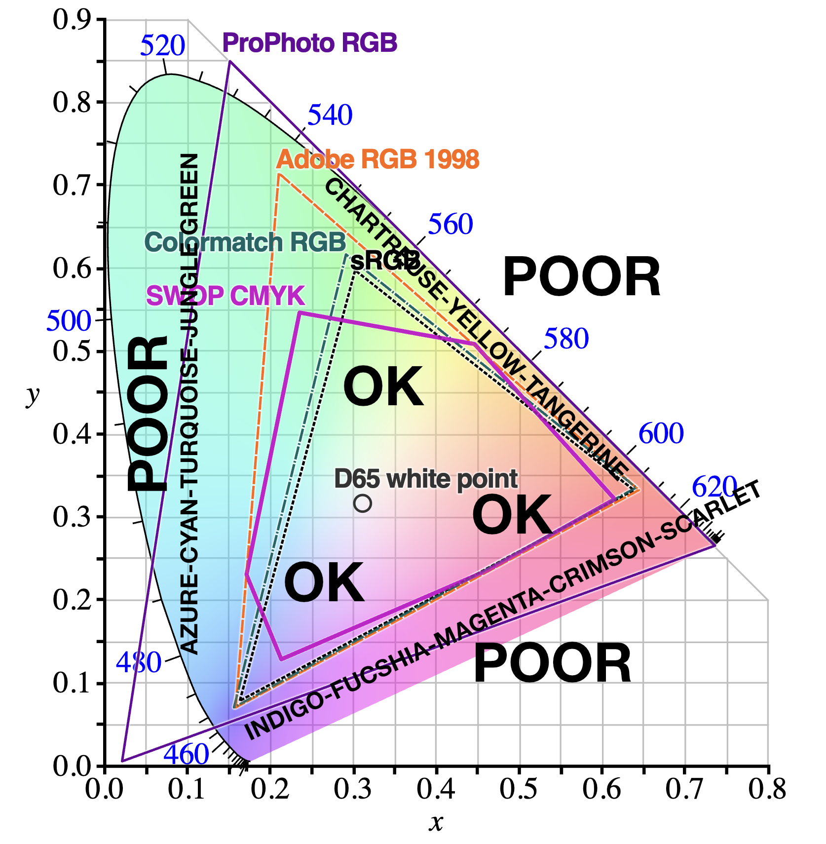
This chromaticity diagram (truncated U shape) shows the limits of human perception based on decades of experiments. POOR is where digital capture and repoduction is poor, and OK is where things are OK. (Note that this digram cannot actually show you those missing, poorly reproduced colors because of these aforementioned limits!)

Here is a slightly clearer image of just how limited sRGB is:

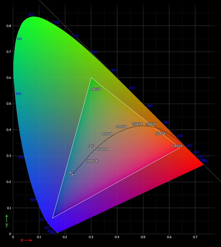
The D65 white point above, is the fully desaturated point where R=G=B. What this means is that really saturated parts along the line between R and G, between G and B, and between B and R, are forced to be less saturated than in the real world. Hence these are color areas where saturated oil paints might chime in… even at lower values or higher values. That means you can mix saturated dark greens that photographers can’t even dream of! Dark fuchsia shadows, fluorescent deeply saturated browns and oranges, and bright high value colors in these areas that sRGB can’t touch. (FYI value or brightness is perpendicular to the plane here.) Just me and the bees enjoying all sorts of out-of-gamut colors.

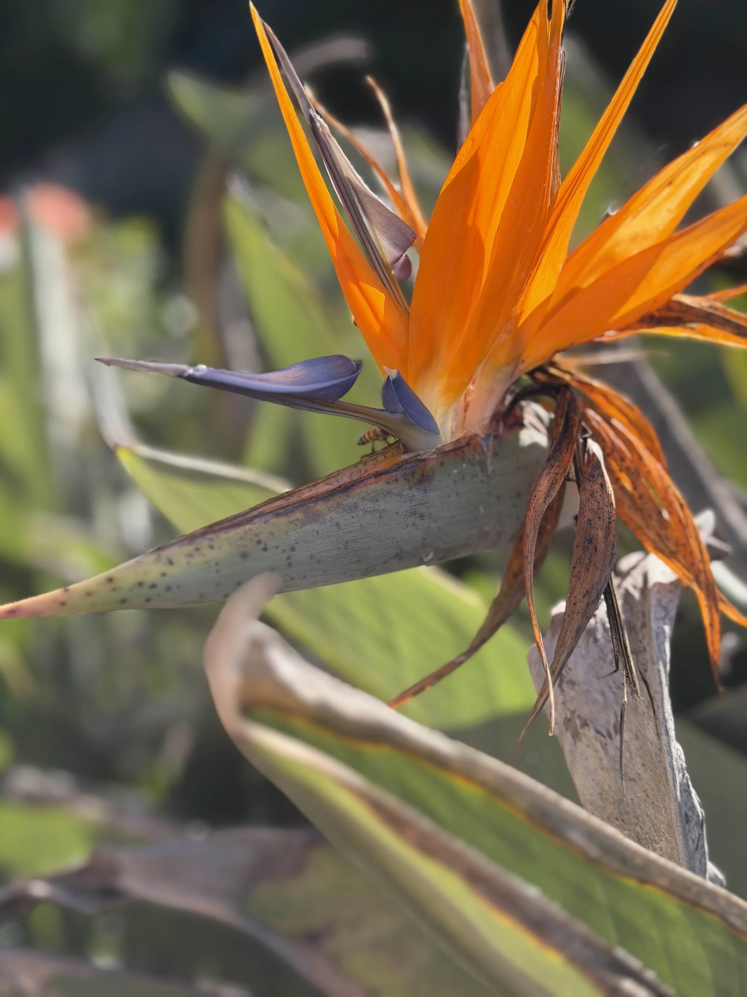
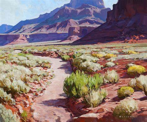
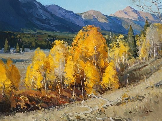
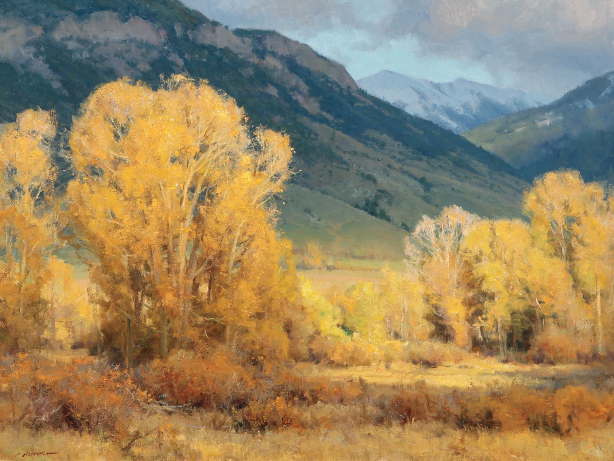
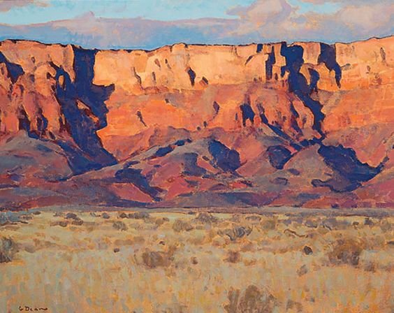
The bright orange above does not turn yellow when you look at it in reality. And the dark shadows do not turn red when you look at it in person. It stays all one hue, to the eye. In addition, essentially all of the leaves, and especially the shadowy parts of the leaves in reality are much bluer and cooler, and almost none of the green has yellowy tinges to it. In person, the cool green brightens up without changing hue. If you can see the colors of the world around you more carefully than anyone else, and if you are aware of the limits of the tools that people are used to, especially all of the digital media we are surrounded by, and you can figure out how to reproduce the colors of the world in terms of colors in oil painting, people will just naturally be blown away by what you put on the canvas. It will feel like you’re getting away with something. It isn’t just about sticking straight pops of the most vibrant orange or fuchsia right on the canvas. It’s also about how you arrange the tension and release of saturation contrast, and how you compose it on the canvas overall. But when you nail it, unless people are just as aware of all the technical things happening, they will feel that kapow feeling and not know why. It’s like performing a magic trick.

The engineers who made the image processing pipeline on my iPhone were forced to make a decision about what to do when people try to take pictures of really brightly colored, out-of-gamut objects. In photo above, it looks like they shifted the hue of orange to be more yellow to make it appear brighter and then they shifted the dark toward red to read as still bright but less hot. But it really doesn’t look anything like the original. Like I said it all stays one hue.

If we call R red, then you can also paint a color I will call ultra-infra-red, meaning the reddest red people can see, which the sRGB R primary renders as a slightly tomatoey red. That is another point in oil-painting’s favor. Deeper reds. You could collect up objects that remind you of these colors. It is possible that even spot colors (individual print colors that are not limited to being reproduced by CMYK) might come in these shades. For example see attached photo below which uses neon orange as a primary (clipped to sRGB). n person, this box is almost as bright as the bird of paradise blooms.

Or you could keep swatches of oils of these colors on the wall as inspiration. THE FORBIDDEN CORNERS OF THE COLOR WHEEL! (Which is actually not a wheel but that truncated U shape.) Or you might gather paper paint swatches from a hardware store. I’m just trying to think of non-digital ways of keeping certain colors on hand for reference and inspiration.

(The DayGlo Color Corp offers vibrant daylight fluorescent pigments for coatings, plastics, packaging, textiles, and more. Bold color starts here. https://www.dayglo.co)

However you use these out-of-gamut colors in oil painting (sparingly of course), have fun with paintings that go far beyond the world of photography.

WHY LANDSCAPE PAINTING IS HARDER THAN YOU THINK

I believe that drafting (drawing) is the most feared component of representational painting. It parallels the fear of math in our educational system. Or the fear of scales in music training. It is a demanding mistress. One reason for the fear is that drafting is the thing most often noticed by the layman when it is lacking.

 Because the fear of drafting is prevalent in the art community, then portrait painting is seen as the hardest of the genres of representational painting. And landscape painting is seen as one of the easiest. I had a teacher explain to me once that if a nose is a quarter inch off in a portrait, it is immediately evident, but if a branch on a tree is a quarter inch off, then that isn’t a big deal.

There is some truth to this, but the broad generality that landscape painting is easy is false. And here is why.

 REASON 1: COMPOSITION

Composition is a significant component of all art and design. Making sure that there is a clear center of interest and that the rest of the artwork is subordinate to that center of interest is important. This is sometimes referred to as “orchestration.”

Choosing a center of interest in portraiture is simple. The center of interest is the face. As humans, we immediately gravitate to a person’s face.

This painting by John Singer Sargent is a good example.

Lady Agnew by John Singer Sargent

The same goes for figure painting – the face will generally be the center of interest.

A Silent Walk - Jeremy Lipking

You will notice that in the painting by Jeremy Winborg below, there is a lot going on. But even so, the face is still the center of interest.

Jeremy Winborg - Unknown Title

Ditto for the painting of wildlife. The face is still the center of interest.

The Great Bear by Bob Kuhn

 In still life painting, the still life is arranged by the painter who chooses the composition before even beginning to work, but you can’t arrange the landscape to meet your compositional needs. . . Or can you? More later.

In this still life painting, one area is easily seen as the center of interest - the orange slices, single grape, and reflection on the copper pot.

Jerry Weers - Unknown Title

One way to overcome the issue of determining the center of interest in a landscape is to add some human figures. Those figures immediately draw the viewer’s attention and can become the center of interest of the painting. Voila! The problem is apparently solved.

Edgar Payne - Unknown Title

Taos Sun - John Moyers

Of course, this is not quite as easy as it seems. A center of interest is most often the place in a painting that has the most contrast (brightest lights and darkest darks), the most intense colors, and the highest detail. So, you could have a landscape painting in which a patch of light on a cliff is the most vibrant spot and the figures are a distraction, unless the figures are purposefully made less vibrant or detailed. So, orchestration of the composition must still take place when adding figures to a landscape. .

In this Edgar Payne landscape painting, the figures do not draw your eye (because they are a part of the shadow shape) but are added simply to show the immensity of the landscape around them. The true center of interest is the light and shadow on the cliffs. Notice how the row of horses draws your eyes back towards the cliffs.

Edgar Payne - Unknown Title

In this painting by G. Russell Case, the figures are the center of interest.

G. Russell Case - Unknown Title

Pure landscape (without humans) is difficult because you must figure out a center of interest and then subordinate everything else to it. This is tough because when you look at the landscape around you, you see many things that are beautiful. Think of an iconic landscape like the Grand Canyon.  If you are at the rim looking into the Grand Canyon at sunset or sunrise, you can see some spots of beautiful light, perhaps an interesting, gnarled tree growing on the rim, and some fantastic cloud formations in the distance. And if you were to paint the scene, it is tempting to add all of the beautiful things you notice to the painting. However, if you do that, then the viewer’s eye jumps from one pretty thing to the next, and the feeling of the painting is somewhat unsettling.

All of this said, there can be a primary center of interest, a secondary center of interest, or even a tertiary center of interest if one is stronger and others less so. An artist who can do this well is approaching mastery. In this painting by Josh Elliott, the left side of Shiprock is the primary center of interest and the buildings in the foreground are a secondary center of interest. Because the buildings are in shadow and read to the viewer as a part of the shadowed foreground, then they do not overwhelm the primary center of interest.

Josh Elliott - Unknown Title

The other compositional element that works in conjunction with the center of interest is the eye path. The eye path is the way that the viewer’s eye moves into and through the painting. Is there a river, stream, arroyo, or pathway that draws your eye into the distance?

Josh Elliott - Unknown Title

Josh Elliott - Unknown Title

Do elements in the painting point from one thing to another moving towards the horizon line and the sky?

Ray Roberts - Unknown Title

Observe how the foreground rocks and water in the above painting by Ray Roberts lead the eye towards the distant cliffs and horizon line.

James Reynolds - Unknown Title

The shoreline in this painting by James Reynolds leads the eye to the bushes and small stand of pines on the right, then upward to the left through the light green patch to the large stand of pine and snowy peak just left of the middle of the painting.

I believe that composition in landscape painting is more difficult to manage than in any of the other representational genres.

REASON 2: MASSING

Massing is choosing where in a painting to add detail and where to leave it out or “mass” the elements together.

I have seen many paintings in which the artist is a good drafter and adds significant detail to the foreground, the middle ground, and the background.  While this is technically impressive, it is nonetheless hard to look at. An artist should show the viewer what is most important to look at in the painting, and massing is one of the ways to do this.

 I believe that the tendency to add detail everywhere comes from the ubiquity of photography in our lives. In general, most photos are full of detail everywhere, but the human eye does not really see the world the way a camera does. Our eyes see a central object or area that we are focusing on, and our peripheral  vision is not as sharp. Good painting imitates human vision more than it does photography. This is not to say that the peripheral parts of a painting should be a blur, but rather that they should be subordinate to the center of interest and factored into the eye path of the painting.

 In landscape painting, this often means that each leaf or blade of grass in a painting should not be individually painted, but instead, that the tree should be one large shape with perhaps some leaves painted in relative detail in strategic places to suggest the presence of leaves throughout.

Josh Elliott - Unknown Title

Ray Roberts - Unknown Title

The concept of massing (versus detail) is akin to what in the world of biology is called lumping versus splitting. In my study of malacology (shells), I learned that some malacologists have the tendency to want to make broad definitions that cover large numbers of species of mollusks (shells) and some malacologists want to make many small categories whenever slight differences occur. Each approach has its pit falls. Lumping will ultimately end up with such broad categories that those categories become unwieldy, with items placed in them being significantly different from each other. On the other hand, splitting will generate so many categories that there may be no real significant differences between the categories.

 This concept also applies to other disciplines like literature, history and music, in which categories are carefully defined and applied. Some individuals tend towards fewer broad categories and some individuals tend towards many smaller categories.

 Of course, this concept also applies to categories in art history. Was this painter an impressionist or not? Or do we want to make a new category called the “luminists”?

 The way that I apply the concept of lumping versus splitting is somewhat different, however.  In representational painting it is the choice between what details to put into a painting (detailing or splitting up an element) and where to do this, and what details to leave out of the painting (massing or lumping elements in the painting) and where to do this.

 I believe that the distinction between massing and detailing is the single most difficult balance to master when painting in any representational genre, and especially when painting the landscape.

Understanding and applying massing is harder than composition, values (although they are a close second), color, temperature, drafting, edges, brushwork, or anything else.

 As I have watched the careers of many painters over decades, I have observed that most good painters started at one time by putting in way too many details and have learned to mass over time. There are  smaller numbers of painters who start with too little detail and then learn to add additional detail to the right places as they grow as painters.

 This last tenancy (to add too few details or to under paint) describes the difference between illustration and fine art, something that Roy Anderson taught me in his book, Dream Spinner: the Art of Roy Andersen. In his book, Andersen explains that illustration is meant to have short term function while fine art is meant to have long term function. While illustration is glanced at briefly, a painting will hang in a home for years and must have enough to keep the viewer engaged long-term. And that “enough” is not excessive detail, but rather compositional orchestration, good values, color, temperature, drafting, edges, brushwork, etc.

REASON 3:  ARRANGEMENT OF ELEMENTS

I credit Clyde Aspevig with teaching me this concept, and at the time it seemed like the most foreign thing in the world.

 Years ago, I went to a presentation given by Clyde Aspevig sponsored by the Scottsdale Artists’ School and he talked about many painting ideas, among them purposefully moving and altering elements in the landscape. Aspevig told us that early in his career he looked for the perfect landscape, but he never found one. At some point, he realized that as an artist, he could rearrange the elements of the landscape to be more interesting and closer to perfection.

 For example, if you have a line of trees that are all the same size and height, the painter might change them to make some taller and larger and some smaller and shorter.

Clyde Aspevig - Unknown Title

This concept was further strengthened for me when an art mentor taught me the phrase, “No two intervals (or elements) alike.” As applied to the above example, then not only should no two trees be the same in size or height, but they should also not be the same distance apart.

John F. Carlson said, “Never take nature as stupidly as you find it.”

 The best landscape painters will adjust the elements in the landscape to be more interesting to the viewer and make sure that no two trees, rocks, mountains, etc. look the same.

Clyde Aspevig - Unknown Title

CONCLUSION

 When you factor in composition, massing and movement of elements in painting the landscape, then you begin to see that landscape painting is significantly more challenging than you would guess.

 As an example, I have a dear friend who is an accomplished painter of portraits, figures, and animals. She once agreed to paint a small landscape for a show of landscape works that I curated. She did a good job, but told me that it was a struggle, even though she often painted background landscapes into her figurative works. The orchestration of the painting was significantly different than anything she had ever done before. Her final comment was, “Landscapes are hard!”

BRUSH CLEANING TIPS

I am notoriously hard on brushes, and so I have learned a few things about cleaning them in order to lengthen their lives.

Here are the steps that I follow:

1.       Wipe your brush on a paper towel. After trying a bunch of different materials for wiping brushes, I have settled on shop towels cut into 1/4ths.

2. Rinse the brush in a brush washer filled with an oil solvent. I like Gamsol which is pretty much the industry standard. I try to wait and use a 20% off coupon at Blick because Gamsol is not cheap. Because I live in Arizona, I can buy it by the gallon. My understanding is that you can’t do that in California because of hazardous materials laws. I’ve heard that some artists from California will stock up if they are out of state.

3.       Clean the brush thoroughly with soap. You can buy expensive soaps which are especially made for cleaning brushes, but I’ve found that Ivory soap is mild, works well, and is much cheaper.

First wet the bar of soap, and then run your brush directly over the soap picking up as much soap as you can. Then rub the soap-filled brush around in your hand dislodging as much paint as possible.

Squeeze the soap and paint from the brush into the sink, running your thumb and forefinger from the ferule to the brush tip.

Repeat these steps until you see no paint color when you run the brush over the bar of ivory soap. This is one reason that I like Ivory soap. It is white and you can really tell if you’ve gotten all of the paint out of the brush.

You can let the brush dry with the soap in it to help it retain its shape or you can rinse it out completely if you wish. If you leave the soap in the brush to shape it as it dries, just run the brush back and forth in your hand to remove the soap before you use it the next time and then rinse it out.

You can use this method at the end of each painting session or just on a fairly regular basis.

If you are like me and neglect a brush which is full of dried paint, all hope is not lost. A friend recommended Murphy’s oil soap. I keep a couple of inches of Murphy’s oil soap in an old jar and stick the brush in the jar to soak overnight. Wash the brush out in the morning using Murphy’s oil soap, and the paint should come out.

MORE ON THE GREATEST LIVING WESTERN LANDSCAPE PAINTERS*

*For many, many more of my favorite representational painters, follow me on Pinterest.

I apologize for taking so long to post another article. Amazing how life can get away from you.

In the past I have posted about some of my favorite landscape painters, Clyde Aspevig, Ray Roberts, and Len Chmiel, and what I have learned from them.  (Aspevig – to reposition landscape elements; Roberts – to group values into strong shapes; Chmiel – to take chances with composition).

I also mentioned several others - Matt Smith, Josh Elliot, John Taft, Mark Haworth, Peter Holbrook, Arturo Chavez, Glen Dean and Kathryn Stats. I should add to this list, John Moyers, and then note that both John Moyers and Glen Dean have really transitioned into being figurative painters rather than mostly landscape painters. Of course, there are often landscape components in their figurative works.  I pulled some older paintings for both of them which are mostly or completely landscape works. (Fortunately, I’ve saved a bunch of older works to Pinterest over the years.)

Here are the works for John Moyers:

John Moyers - October Boom

Here are the works for Glen Dean.

Glen Dean - Unknown Title

Glen Dean - Unknown Title

Glean Dean - Pontatoc Peak

Glen Dean - Sierra Grandeur

Glen Dean - Coastal Watchmen

You can see why these two artists still belong in my stable of favorite landscape painters, and I wish that they did a few more landscapes now and then.

But the rest of my posting here will be about JOSH ELLIOT, whom I’ve grown to really appreciate. I think that in the time I’ve watched his work (15 years or so), he’s grown to be a top tier painter.  

As I’ve posted in the past, the truly great artists have no weaknesses. They have great composition, values, colors, drafting, brushwork, and edges. These are the areas which are the foundation in painting. I believe that Josh Elliot has no weaknesses in any of these areas. Here are some of my favorite paintings by him. See what you think:

Josh Elliot - Vermillion Variety

Josh Elliot - River Glitter

Josh Elliot - Shiprock, Shadows, and Shelter

Josh Elliot - Gilded Grove

Josh Elliot - February Sonnet

Josh Elliot - Spiral of Time

Josh Elliot - Acadia Lobstermen

Joseh Elliot - Transformation

Josh Elliot - Common Ground

Josh Elliot = Desert Decor

Josh Elliot - Unknown Title

Josh Elliot - View of North House

Josh Elliot - Sunlight and Shadow

Josh Elliot - Unknown Title

Josh Elliot - Cloudburst

You will note that he paints landscapes from all over the West and is pretty successful at a number of different types.

How Does Howard Do It? (Or What Serendipity Taught Me)

The 11th annual Scottsdale Art Auction was recently held (http://scottsdaleartauction.com), and the Thursday night before the auction, I had the privilege of spending an evening looking at all of the auction items on the second floor of the Legacy Gallery in downtown Scottsdale. It is truly better art than you will find together in one place almost anywhere, including in most museums. This year was no exception, with outstanding art by a wide range of mostly deceased Western artists.  A notable exception to that is the art of Howard Terpning. Howard is still alive, and his art is incredible to see in person. And as you know if you know much at all about Western art, his works sell for truly remarkable prices for a living artist. This year the selection of his paintings were not his best, but they sold for around $250,000 each.

460_345_resize.jpg

The reason that I believe that Howard Terpning is so great is that he has no weaknesses. Nearly all of the top painters today, although usually very accomplished in almost everything, generally have a weakness. It might be color, drafting, composition, brush work, massing, edges, or values, to name the major categories.  Howard is strong in every single one of these areas, and because of his technical excellence, his passion for his subject shines through. "How does he do it?" I wondered as I looked at his paintings in the art auction show. This is something that I have wondered for quite some time.

At about this same time, I ordered a book on the Taos Painters from an online vendor. When it came, it was the wrong book.  Dang!  I hate it when that happens!  Do I want the hassle of trying to return it, or should I just reorder the book I really wanted in the first place? The book that came in the mail turned out to be Masters of Western Art written by Mary Carroll Nelson and published in 1982. After flipping through the book, I decided to keep it. One of the major reasons was that it contained a section on Howard Terpning written when he had only been painting full time for about 5 years. (Prior to that time, he was a  successful illustrator.) 

I read through the 10 pages contained in the book about Howard, and while the biography and photo of his studio were good, what really interested me was the 4-page demonstration of his working method. 

Rough Sketch:  Howard begins with a rough sketch to establish composition and values:

Preliminary Drawing: Then Howard does a preliminary drawing which is later transferred to the canvas before he begins to paint.  In this preliminary drawing, he essentially does more work on the center on interest (the party of Indians) and further developes the foreground.

Preliminary Drawing.jpg

Preparing the Canvas: Next, Howard tones the canvas and transfers the preliminary drawing to it using light gray chalk. Look at the bottom right-hand corner of the image below and you will see a section showing this under-painting with some gray-chalk outlines which are barely discernible. 

Blocking In: He follows up the the toning of the canvas by blocking in all of the major sections of the painting with thin paint applied in large brush strokes. This more fully establishes the value relationships and adds a gestural dynamic to the painting:

Developing Large Shapes and Colors: The next stage consists of further development of the large shapes and colors. Notice how he very carefully preserves his original value relationships. The painting is still fairly loose at this point and the large masses are readily apparent.

Shape & Color Work.jpg

Center of Interest: In the next phase, Howard works on the center of interest, the figures and the horses, keeping the values simple and the anatomy correct. The center of interest should be somewhat more developed than the surrounding landscape, but not be over painted.

Development of the Surrounding Landscape: At this point, Howard works on the sky, the cliff, the pine trees and the distant mountains. Again, the idea is to make everything appear structurally correct without overworking anything. 

Finishing Up: Lastly, Howard finishes the horses and figures. The farther they recede into the paining, the more monochromatic and simple they become. He finishes the water and the foreground rocks, not painting individual rocks, but suggesting their shapes. 

Moving Day on the Flathead, by Howard Terpning, 1981, 40" x 58". Winner of the Prix de West in 1981, permanent collection of the National Cowboy Hall of Fame. 

(I apologize for the line on the photo. The finished painting was spread over 2 pages in the book, and this was the best that I could do.)

Part of perfectionism is to know yourself well enough to have a work flow process that anticipates and forestalls errors such as drafting problems, edge problems, loss of value relationships, overworking, etc. I would love to ask Howard if, after another 30 years of painting, he still uses this same working method. My guess is that he does. Having the discipline to do a rough sketch, preliminary drawing, tone the canvas, block in, etc. seems tedious, but the truth is that it is the fastest and most reliable way to a great product in the shortest amount of time. If you have ever started a painting and then lost your way or had to throw it out because you couldn't solve the problems, then you will understand.

WHAT DOES IT TAKE TO BE A SUCCESSFUL ARTIST?

I’ve thought about this question for many, many years now. One of the reasons that I have been so interested in this subject is because art has always been my first love, but I was pushed out of the art program in college because, “No one can make a living in the fine arts.”


Perhaps when I was in college this was true. And looking back, I am happy that I didn’t continue through college as an art major because most academic art programs, then and now, emphasize expression over craft. The traditional atelier experience is usually missing from a college setting.


Creation without technique is hollow, as is technique without creation. Imagine a musician that never practiced his scales and made technical mistakes all through his performance. No matter what kind of passion he played with, the technical errors would ruin it for the audience. And technically perfect music without emotion is soporific. Art is exactly the same. You must have proficiency in drafting, values, color, edges, composition, design, etc., before you can begin to express yourself creatively as a painter. Self-expression in art has been for many decades an excuse for not mastering the basics.


But back to the question at hand: what does it take to be a successful artist? Here are the things that I think you have to have in order from most important to least important:


PASSION:

Red heart.png

The most important thing, and really the only thing that will keep you going long-term, is passion. You must love creating your art so much that you are brought back to it again and again. When I returned to painting after years away from art, I felt like I was going to explode because the drive was so strong. The edge is off now, but if I go very long without painting, I begin to have a feeling of impending explosion. I paint because I must.


DISCIPLINE:

Climbing Symbol.png

In the art workshops I have taken, I have noticed that most people quit when their drawings or paintings are “good enough.” They can see that there are still problems with their work, but they don’t feel like fixing those problems. In the three-hour workshops that I have taken, many of my fellow students quit after about 2½ hours. If you are a serious art student, then you must have a drive towards perfection and the ability to make yourself work towards it. Come early and stay late. Solve the problems if you want the growth. This is not something that is traditionally associated with artists, but I believe is critical.


EXPERIENCE:

Clock.png

If you have the passion and discipline, then you will stick with your art long term, and accumulate the experience that you need to be good. Go look at some of the early works of the people who are considered great today. They started out as bad as anyone else. If you look through the images of art works from the great western art auctions, Scottsdale Art Auction, the Coeur d'Alene Art Auction, the Jackson Hole Art Auction, the Santa Fe Art Auction, Altermann Galleries Auction, Bonhams, Heritage Auctions, etc., you will occasionally run into an early work by one of the Taos painters, Russell, Remington, Carol Oscar Borg, Edgar Payne or Maynard Dixon that is just embarrassing. It really takes time to train your eye and learn the skills. “See a million and paint a thousand” (anonymous) is a good guideline.


SUPPORT:


thumbs up.png

There are two parts to this – 1) support from family and friends and 2) professional support. Because it takes such a long time and many hours of practice to become a good painter (time that you could spend cleaning the house, doing the laundry, hanging out with family or friends, etc.), you really need family and friends who support you through all of the years when your work looks horrible and you are agonizing over it. You need people that believe in you and can see that eventually you will gain the ability to express what you see. The second part of this is gallery or marketing representation. Artists are notoriously bad at putting their work out there. Having a gallery or representative that really believes in you and promotes your work is critical. Here’s the irony. A gallery may take on an artist because they really like their work and believe in them. That belief and support in and of itself can make the artist successful long term. I could name several of contemporary and historical artists (but I will refrain) who I believe are or were successful because they were picked up by major galleries and promoted over several decades, but whose work I believe will not stand the test of time.


TALENT:


Light bulb.png

This is the least important of all. My husband and I read recently read a great book by Geoff Colvin called Talent is Overrated. We actually read it out loud to each other and talked about it as we read because we thought it was so profound. His thesis is that is that the greatest achievers succeed through endless "deliberate practice" and that what was traditionally thought of as talent may be the ability to learn something a little faster than others or have the drive (passion?) to keep at something until you have mastered it. No one wants to hear this because it is easier to believe that you just don’t have the talent. Lack of talent is the perfect excuse. I believe it was Richard Schmid who said that artistic talent is the ability to see what is wrong or out of place in a work of art. Of course being able to see what is wrong with a work of art is wasted if you don’t have the discipline to work at fixing the problems.


DEFINITION OF SUCCESS:


INCOME:


money-1.gif

My college art professors defined success as being able to make a living with art. I reject that definition as being narrow and petty. Life is far more than survival. However, it is good not to starve, because that puts an end to growth.


FAME:

12284284912137769999sivvus_weather_symbols_1.svg.hi.png

Most people when asked would probably say that the successful artists are those, like Monet and Van Gogh, who are known and loved world-wide. (Tell that to Van Gogh who never sold a painting during his lifetime, and was supported by his brother, Theo Van Gogh. How much richer is the world because of Theo’s support of his brother?) But being world-famous is largely due to luck, the current directions of various art trends, and the vagaries of popularity. There are many artists who were masters and lived at the time when representational art was going out of favor (like William-Adolphe Bouguereau)‎ who never became world-famous but are truly great and successful artists.

Heart & Star.png

The New York painter, David Kassan said in a lecture I attended, “Art is not about being rich, but about living richly.” And there really is something to this. Being able to do on a daily basis something that you really love is a great measure of success. But there has to be something more than just happiness as well.


I think success in art is part happiness, part continued growth and mastery, and part sufficiency. If you have enough to cover your needs (and reasonable wants), are able to grow and produce on a daily basis, and are truly happy in your work, then you are successful. But each artist will have his own definition of success. Enough income to pay for supplies? Enough income for daily needs? Enough income to save for the future? Living in a picturesque location? The ability to travel? Acknowledgment from your peers? Awards in major shows? Whatever your definition of success in art, passion, discipline, experience, support and talent are an essential part. View shared post